
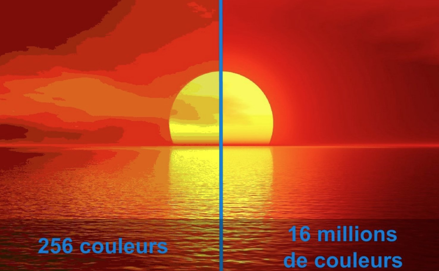
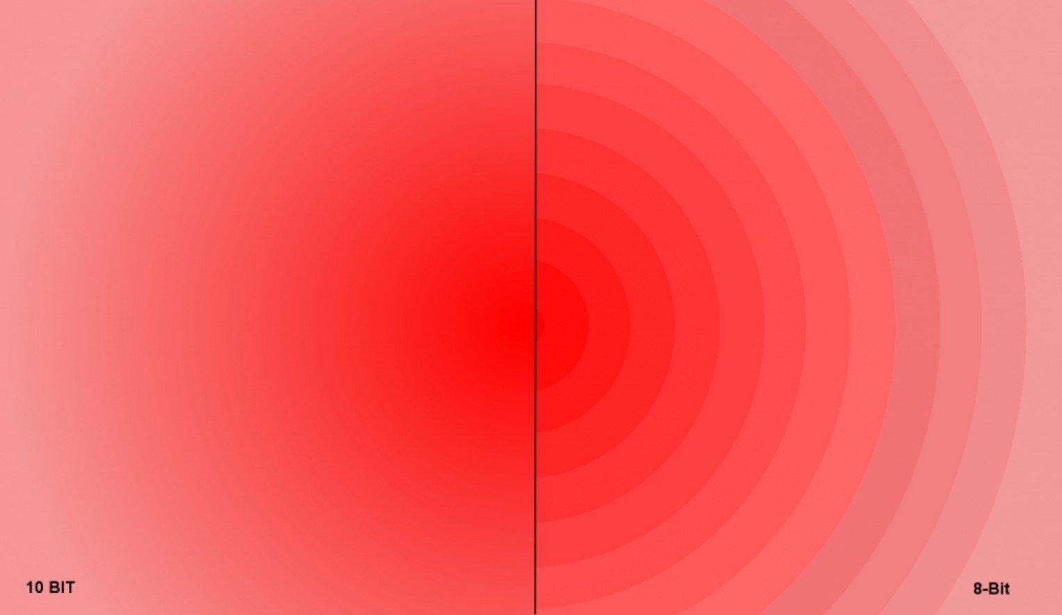
Simply put, 8-bit versus 10-bit is the difference between displaying 16.7 million versus 1.07 billion colours.
The human eye can see every rainbow colour. But the brain can only process about 10,000 different colours and about 100 different shades for a total of about one million colours/tones at any time.
So, what is the big deal with smartphones, monitors or TV screens that offer 8-bit/16.7 million or 10-bit/1.07 billion colours? Bear with me for a simple yet detailed explanation.
Let’s start with the summary first. Regardless of the number of colours/tones, we can see at one time, it is all about which ones we see and their intensity/saturation from the billions of colours/tones in the full colour gamut.
How is colour made?
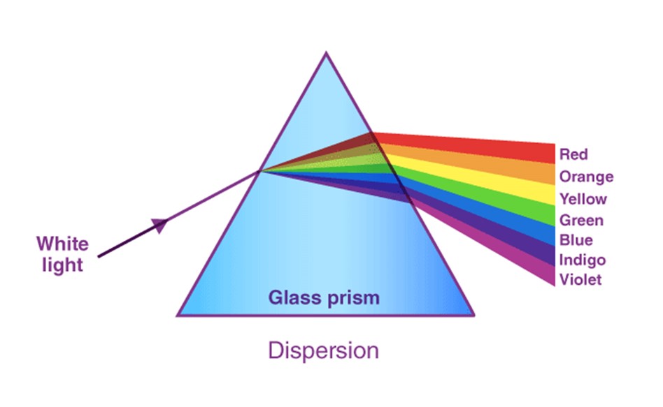
All colours, including white, are made from primary Red, Green, and Blue (RGB). The term ‘ full colour gamut’ refers to every possible colour combination/tone.
Sunlight is 100% of the colour gamut and contains RGB and secondary colours Orange, Yellow, Indigo, and Violet. When shone through a prism, it makes every colour of the rainbow. These are seen by the ‘cones’ in your eyes, and ‘rods’ transmit black and white (greyscale) information to the brain.
What are the most used screen colour standards?
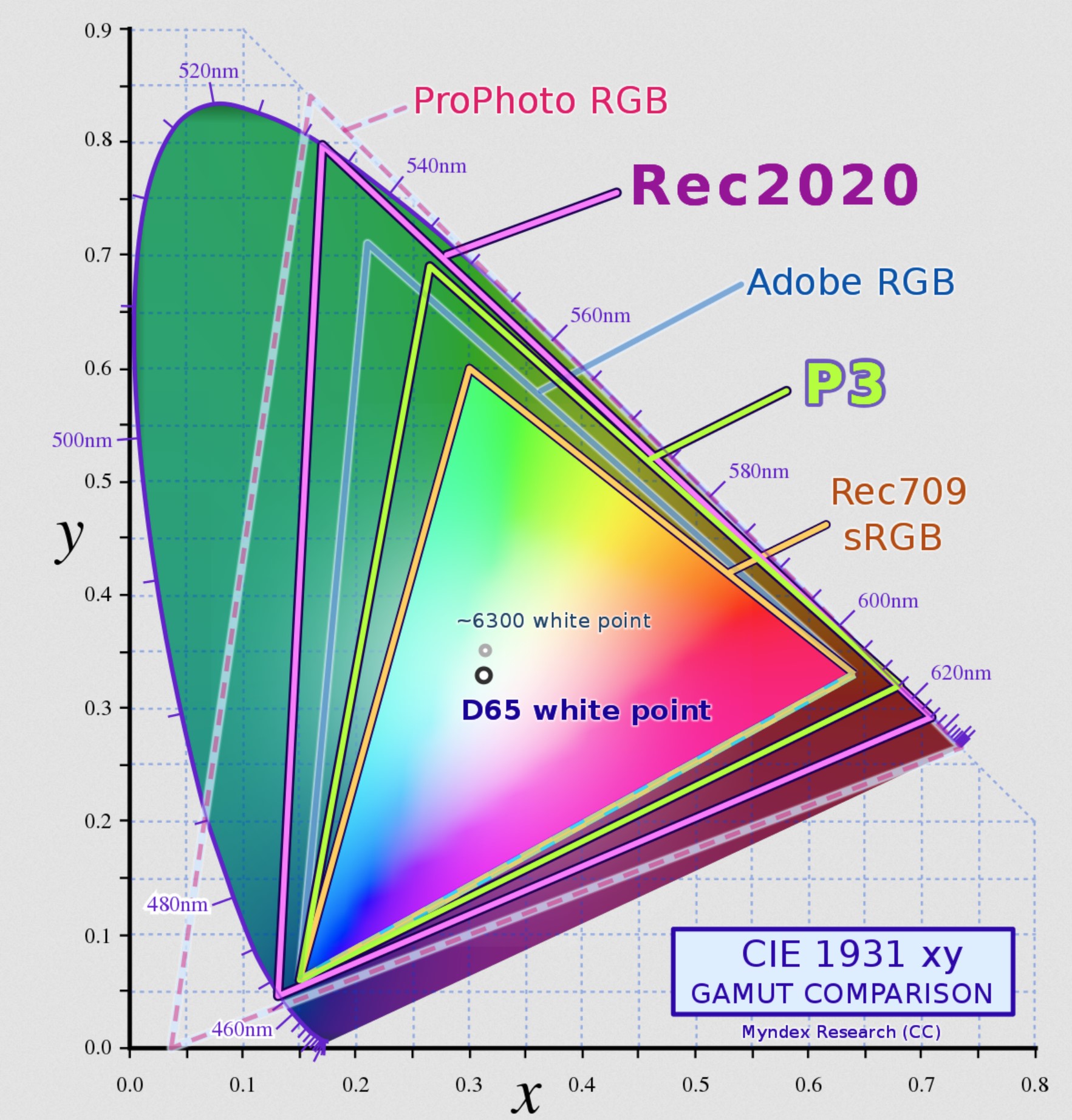
sRGB or Rec709 (standard Red, Green and Blue) is the quite narrow 8-bit/16.7 million colour space covering about 30% of the colour gamut. It is used by most colour monitors, inkjet/laser printers and the internet (WWW). It is made from (R) 256 x (G) 256 x (B) 256 = 16.7 million colours/tones. Because of the limited 256 shades, colours tend to show banding and are less saturated and more muted.
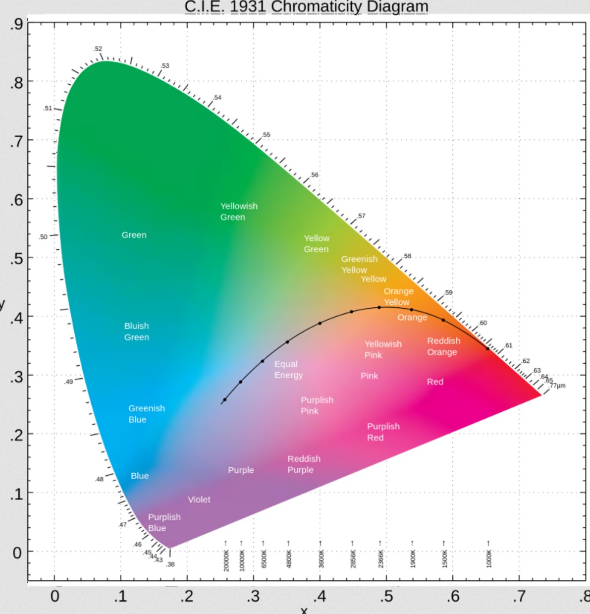
If you look at the CIE 1931 chart below, you will see that sRGB does not fully cover the Red and Blue space (where you would see more orange, yellow, indigo and violet) and not much of the Green space at all.
Adobe RGB is for photos using a CMYK (Cyan, Magenta, Yellow, and Black inks) and increases Green and Red coverage to 50% of the colour gamut. This is only useful for designers and creators that want to see what a printed image looks like.
DCI-P3 is for movies. The standard is 10-bit/1.07 billion colours and covers about 50% of the colour gamut. It is made from (R) 1024 X (G) 1024 x (B) 1024 = 1.07 billion colours/tones. It covers more Red and Green space, and in TVs (especially OLED), it uses a Blue backlight (that makes White). More steps equal smoother colour gradients (less banding).

One day we hope to achieve Rec 2020, which is 75% of the visible light spectrum.
Delta E – colour accuracy
Delta E measures colour accuracy – how well a screen can display against the colour standard. It is the difference between the reference colour and what you see. A Delta E of <2 means Netflix Red (RGB: 229 9 20) looks just that, not a pinkish or orange-red. The human eye starts to notice differences between 2 and 4, and higher than that, the inaccuracy is very noticeable and can be unpleasant.
Colour temperature – Cool to Warm
The colour temperature ranges from about 3000 (candlelight/warm) to 8000 (blue sky/cold). It extends further beyond that but is not material to displays. Sunlight has a colour temperature between 5000-6000° Kelvin.
Colour screens ideally have a colour temperature calibrated at about 6500° K (D65 white point or Equal Energy reference), which is about the mid-point between Red and Green. Colour temperature also affects Delta E, so it is measured at D65.
So when we say it has a native warm/yellow or cool/bluish tint, that means a lower or higher colour temperature.
The human eye craves blue light (shorter wavelength) versus red and green (long wavelengths). It allegedly affects human circadian rhythms (sleeping patterns) and can make vision blurrier (over time). That is why a warm light is better than a cool white one. When a screen states it has low Blue Light control, it can change the colour temperature to warmer but at the enormous expense of colour accuracy.
So back to the big deal – 8-bit versus 10-bit?
We have three main viewing devices – TVs (larger screens), computer monitors (24-49” screens) and smartphones (6-7” screens or larger Folds).
TVs are easy. If it has 4K Dolby Vision or HDR10+ accreditation, then it is 10-bit. Even cheap TVs can now be found with 10-bit because the colours look so much better.
Monitors are generally 8-bit for LED/LCD consumers and productivity and 10-bit OLED/Mini-LED/FALD for professionals.
Smartphones are contentious
Samsung, one of the largest display panel makers for all three categories, argues that our eyes have become accustomed to the narrower sRGB gamut. Additionally, 8-bit uses less energy and has a lower manufacturing cost. Samsung uses 8-bit in its flagship Galaxy S21, S22 and now S23 Ultra. These do not support Dolby Vision, but support HDR10+ downmixed to the panel’s peak brightness capability. When you play HDR video content, you can see colour banding absent from 10-bit screens.
Most of Motorola’s Edge 30-series have 10-bit colour and support Dolby Vision (downmixed to the panel’s peak brightness HDR/HDR10/HDR10+ capability)
OPPO says that 10-bit is mandatory for photography to enable a ‘what you see is what you get’ (WYSIWYG) experience on the screen. Its Find X5 series has a full path colour management system of 10-bit from shoot, process, store and display. Dolby Vision Movies and HDR content are superb without any colour banding.
CyberShack’s tests – 8-bit versus 10-bit colours are about image quality
We lined up two 10-bit colour smartphones – the Motorola Edge 30 Pro and the OPPO Find X5 Pro to compare with the 8-bit Samsung Galaxy S22 Ultra (update: we have since repeated tests with the S23 Ultra with the same results). Tests could only be subjective because we do not have a camera that can capture the subtle differences, and most of you will be reading this on an 8-bit monitor or smartphone and won’t see the difference anyway.
We did three tests – Dolby Atmos, HDR10 video content, and WYSIWYG viewfinder versus the finished photo.
OPPO Find X5 Pro with a 3216 x 1440, 10-bit AMOLED screen has a peak brightness of 1300 nits.
- Dolby Atmos movie: It had by far the most accurate colours, smooth colour gradients and a pleasing image.
- HDR 10 video content: Ditto
- WYSIWYG camera experience: It faithfully reproduces what you see on the screen to the finished shot.
Motorola Edge 30 Pro uses a 2400 x 1080, 10-bit pOLED (plastic OLED substrate) with a peak brightness of 750 nits.
- Dolby Atmos movie: Colours were accurate, with smooth colour gradients and, apart from the lower brightness (meaning better viewing in a darkened room), did a good job.
- HDR10 video content: good results with less demanding HDR10
- WYSIWYG camera experience: The viewfinder image to the photo image was consistent.
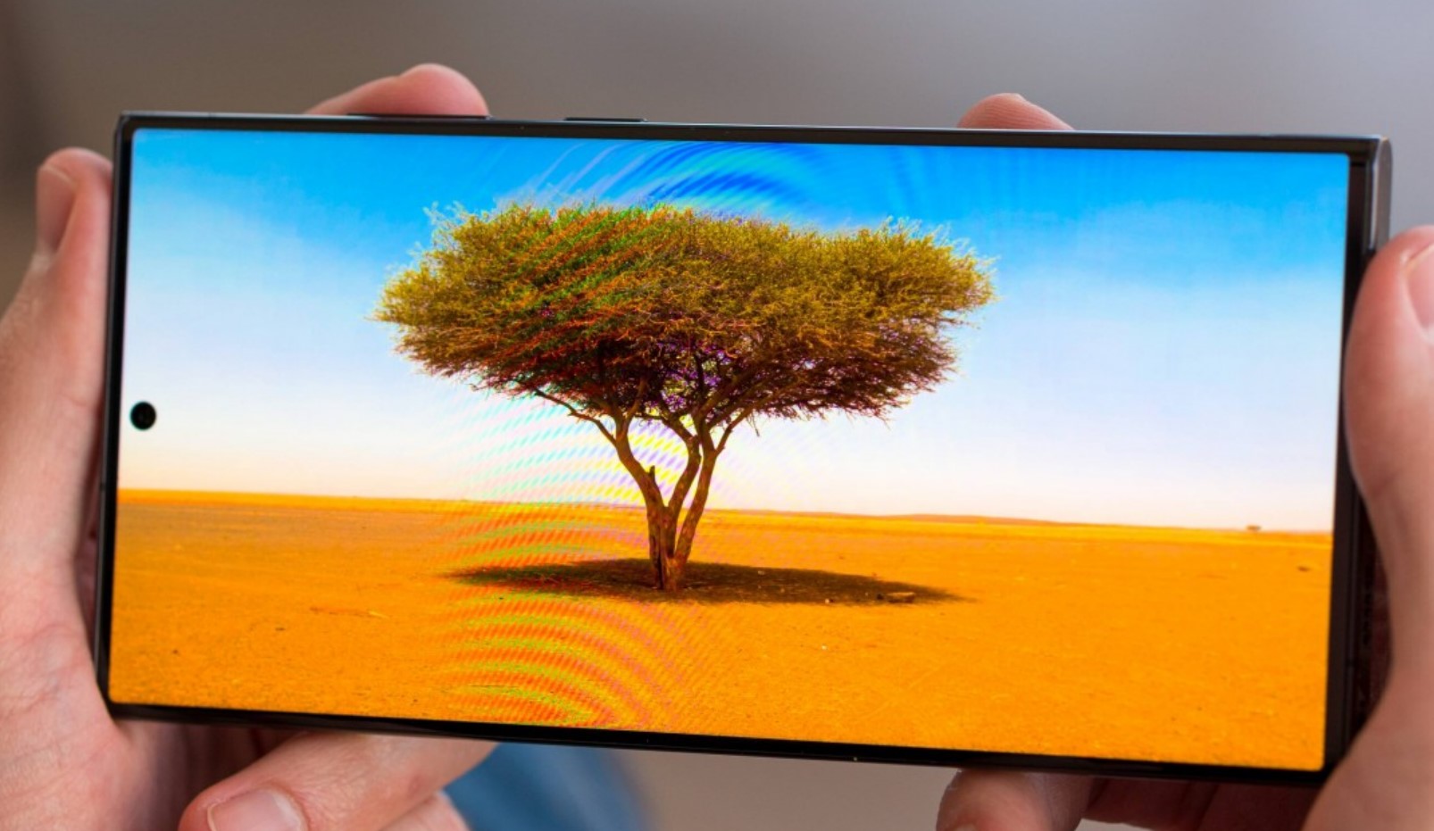
Samsung Galaxy S22 Ultra uses a 3088 x 1440, 8-bit AMOLED with a claimed peak brightness of 1750 nits (but we could not get it above 1300), and the difference between the 8-bit versus 10-bit colours was palpable.
- Dolby Atmos movie: (Downmixed to HDR10). While the others had smooth colour gradients, Samsung showed a ripple-like effect where colour bands changed to different tones. It was visually inferior to the other devices.
- HDR10+ (not HDR10) video content: This is Samsung’s answer to Dolby Atmos and requires video content with suitable metadata. Colour gradient banding was less noticeable.
- WYSIWYG camera experience: The viewfinder image to the photo image had a considerable difference in colour.
Similarly, we tested an 8-bit and 10-bit 4K monitor, and those ripple-like effect colour bands were evident on the 8-bit monitor.
CyberShack’s view – Do 8-bit versus 10-bit colours matter?
If you are a non-professional user, then no. If you want the best image and photographic/video experience, then ABSOLUTELY YES.
The video below is a bit old and is in Indian, but it is graphic, showing the difference between both.


Comments